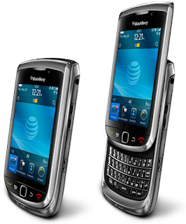
If we're being totally honest, if you're lucky enough to have the choice of Android, Apple, Windows, Bada, or even Symbian, its very easy to overlook a new blackberry handset release as 'insignificant'. For many years now, Rim devices have had 'issues'. Issues that have annoyed, angered, infuriated many an ordinary customer and likewise sales rep. Bluetooth file transfer anyone? Menu's within menu's upon menu's, with sub menu's and sub sections have made the most simple of tasks daunting or impossible. A blackberry without a user manual, is like abseiling equipment in the hands of say, Susan Boyle.
But here it is, the latest release of Blackberrys operating system, I forget which number they're up to and for the sake of this review, it's irrelevant anyhow. Lets get started.
Boot up is difficult as the battery has zero charge in it. Nevertheless I hunt down a compatible Micro USB charger and plug it in. If the EU have done anything right, its standardising mobile phone chargers. Not quite sure how Apple manage to get away with their USB cable uniqueness though? Possibly because they're designed and made in California, although obviously they're sold in the EU. Anyway, after a normally long boot up time, the blackberry is now ready for action.
I'm told that there is no sim card in, which is a worry as there is. It's just not a connected one. No matter, I log onto wifi and hook up to the store wifi. I boot up the web brower and point it to apple.com. The page loads quickly enough, although typing in the address was the usual, alt affair to get the full stop. Still, no typo's with a full qwerty keyboard. The first thing you notice is, this is no galaxy S screen or retina display. Yes, its clearly the best screen on any blackberry I've seen, but it's not wonderful. Double tapping the screen zooms into portions and helps visibility. Opening a bealtes video, (yes, the Beatles are on iTunes, surely we all know now?) Quicktime movie link tries to open and the window displays, but the video doesn't start. The world wide web does seem to be giving smartphone developers a bit of a challenge. Or a headache! You tube is far more successful, a click on the first video and it opens the video immediately. It does look a smidge blocky though, as if its being compressed. But the speaker is excellent. I check the main screen and hit the menu key, from here I have to select 'open tray' (two buttons to open the main menu) I look for an easier way, but alas, there doesn't appear to be one. There are quick links to favourites across the bottom though. Click and hold doesn't work to drag onto the favourites, knowing the BB way, I select an icon and click the menu button, There it is, mark as favourite. I press the end call key, but infuriatingly this doesn't return me to the home screen. The back arrow takes me back. Sure enough, in my favourites is the icon. Menu>Remove gets rid. The dock across the bottom consists of Favourites, Media, Downloads, All and Frequent. The top four of these icons are shown. Brushing down opens THE TRAY! It can be done. Just goto All, swipe down. The Camera looks ok, it boots up fine and takes photo's. Facebook works and looks ok. The calendar is ok on first glance, Month view involves clicking the BB menu button and scrolling to view>Week>Day>Month, by comparison on the iphone, this same task is done with one button click. It plays music, it does video, there's a calculator, tasks, word, even presenter, is anyone still there?
To summarise, it has everything a smart phone should have. It does it all relatively competently. The menu's look smart and navigation is ok, I suppose, but its not the most intuitive by comparison. In all, there is nothing that really excites me. If I got one as a company mobile as has happened in the past, I most likely wouldn't choose it as my first phone. I find it hard to put my finger on what it is thats missing. Perhaps its the way everything has to be 'found out' perhaps it's bias from previous disappointments. But nothing whatsoever about this handset excites me.
Its a massive leap for Blackberry in the right direction. But its a massive leap into a big muddy puddle.
Welcome to Rough Cuts Ltd blog. We offer Photography, Video, Support and Educational services across North Wales. Here you will find technology insights, tips, tricks and recommendations and news about what we're doing.
Monday, 6 December 2010
Thursday, 2 December 2010
Powermat
The first time the Powermat came into our stores, it was an expensive option. You had to purchase a case for your device, then you also had to purchase the powermat to charge it. The powermat was priced at around £80. Now they sell an all in one box solution, but for one device only, (the powermat would charge up to three devices, so long as they had the case attached. This all in one box solution is only £40, so clearly its much better value for money. That said, the old powermat was pretty much future proof. So long as the device was powermat compatible, you'd be able to place it on the mat and it would charge. If in the future manufacturers decide that this tech could be in built, you'd still be able to use your old mat. With this, nice though it is, the charging mat is moulded to the exact shape of the case, so even if your shiny new iphone comes with Powermat compatibility in built (which admittedly is unlikely) it won't fit snugly in the charging stand. You'd just have to sell the old powermat with your old phone as an added extra.
Despite all of this we should acknowledge that powermat have made this technology far cheaper for everyone and if you fancy the idea of just throwing your iphone on its own little bed before you retire, then it makes sense. Whether it makes £15 more sense than the iphone or blackberry dock is another question. No denying it's cool though.
Dr Dre Beats Studio
These are the Beats Solo HD big brother. Firstly the thing that hasn't changed is the sound quality. If there is a difference it's not that noticeable, these sound a little more 'airy' as if there's more space between you and the music. Although that sounds like a bad thing, its not. It feels like a slightly larger sound stage. Although that could just be the psychological effect of the larger earpieces? Both the cheaper units and these sound stunning. There isn't a great argument for paying an extra £100 for the sound quality.
The Studio units are noticeably more comfortable. More in line with the V-Moda units tested earlier. They sit nicely on your head and completely cover your ear. This does away with a slightly odd sensation that happens from time to time of moving your jaw sideways and creating space with the Solo HD's which distorts the music a little.
These units also have noise reduction, although rather disappointingly the cover doesn't appear to close tight. When it's replaced after the 2 (supplied) AAA batteries are installed it can be moved easily. It doesn't rattle and when music is played, it isn't an issue. But these are £250 headphones, the cover shouldn't wobble, surely? Whats even more disappointing is that the noise reduction cannot be turned off. Well, not if you want to listen to music it can't. This is a huge drawback as it means listening to music will mean battery expenditure, even if you're in an almost silent room.
Again, like the V-Moda units, these more expensive units are cased in a hard satchel, but like the Solo HD's, they also still fold. The brackets are very well made and (ignoring the battery cover) they feel very well built.
Overall, these are a tremendous set of headphones. Whether its worth paying an extra £100 for the sound cancellation, Hard case and slightly comfier fit, with the drawback of the wobbly cover and noise cancellation that can't be switched off is up to the consumer, for me, it isn't. The Dr Dre Solo HD's still rule; but I do wish the earpieces were bigger.
Edifier MP300

1 The superwoofer. The kitchen roll shaped bass producing mid section which the satellite speakers attach to.
2 The balance between the 3 speakers. It's just perfect.
If you need speakers for your holidays, or even a (really) small room. You can't go far wrong with these. They come with a portable case as well for the mains adaptor and leads. Not as convenient as a dock, but the pay off in terms of sound quality is worth it.
Thoroughly recommended.
VModa Crossfades vs Beats Solo HD (by Dr Dre)

1) Dr Dre Beats Solo HD by Monster and
2) V-Moda Crossfades.
Both headphones are closed back headphones, meaning you should be able to listen to some quality music, without disturbing your wife whilst she's watching X-Factor. From the outset, it's clear that the V-Moda headphones are the more comfortable. They don't so much sit on your head like the Beats headphones, they rest atop your head and feel seriously comfortable. The beats headphones squeeze your ears a little too much and I have noticed after prolonged use, that if I'm wearing my glasses, they do start to hurt. If I remove my glasses, they're fine. If you're planning on watching TV or read whilst listening to your headphones and you need your glasses to do so, I would look elsewhere. The V-Moda units cocoon your ears, where as the Dr Dre headphones sit 'on' your ear. Somewhat awkwardly by comparison.
Both of the units come with carry cases and again the V-Moda case is a nice solid moulded unit to protect your precious 'can's'. By comparison, the Dr Dre headphones are supplied with a soft bag. Both headphones supply an iPhone, meaning if you don't mind walking along the street in big £150 headphones you can control the volume and skip tracks. The Dr Dre headphones come with a normal lead as well.
As far as styling goes, I guess thats down to personal preference. The solid V-Moda units are well built, but the hexagonal shape of the earpiece isn't really my cup of tea. The more elegant Dr Dre headphones are much more pleasing to the eye and they also fold for added portability. I did read that they had a reputation for poor build on the first batch. But these feel plenty sturdy enough.
The Bass offered by both of these sets of headphones is incredible. 10 or 20 years ago you would really have struggled to get anywhere near the lows being achieved here. Both of these sets, with the right music, can really kick out a pumping beat.
The difference is within the midrange, and its a difference that is really quite staggering. The level of detail, the clarity and the all round excellent sound stage of the one set, makes the others sound completely mushy by comparison. This, despite the comfort issues is what makes the Dr Dre headphones the clear winners, which was enough to make this idiot purchase a set. If you have any passion for music, regardless of its genre (forget the Dr Dre link) they sound incredible enough to make you want them so badly. For the sound that they produce, they're comfortable enough.
LGP500 (or the Optimus 1)
Another android handset from LG hits the shelves and it becomes more difficult to differentiate one from another and again, LG give it a code number & a name, to confuse consumers and retailers alike. This one comes equipped with a 3mp camera and no flash (from first inspection). I get distracted and try a couple of failed attempts at switching it on. Then I realise the tiny power on button on the top of the phone. I peel off all of the protective stickers, (of which there are many) and I give it my full attention. I don't however peel off the screen protector, this looks as good as a case mate screen protector. I'm not sure how hard wearing its likely to be, but for the first month at least, I think I'd be tempted to leave it on and see how well it works. The screen seems responsive enough leaving it in place.
Upon boot up I'm given the option to enter my username and passwords. I am then presented with a vile alpha numeric keypad. So I click the cog, select inputs and change it to a qwerty. This gives me a crammed keyboard, so I rotate the handset and the phone happily obliges by rotating the screen, enlarging the keypad. Then I enter my data, so far so good. I make an input error and tap the cursor to the right part of the screen to correct. The thing that sets this apart from the older Optimus is the capacitative touchscreen and it's instantly obvious that it's far quicker to respond and doesn't need an annoying push. I tap in a couple of errors to see how it copes with correcting mistakes. It doesn't. After setup, a bright galaxy appears, a weather report and a link to the android market. I tap it and, infuriatingly, am asked for my gmail settings; again. Even though I just entered them! I struggle with the tiny qwerty keyboard on the portrait screen and I'm in. halfway through the process, I get a nice sounding reminder that I have 14 mails. I check and see that despite using a dummy gmail account, I have junk. I quickly and easily use the phones interface to see which are worthy of keeping, (none) and delete the rest. As I break to type, the phone keeps switching itself into standby, but switching it back on is easily achieved by hitting any of the keys on the front. From the home screen the main menu is displayed by hitting the middle key. 5 Multiple home screens are now the norm on these devices and they are all present and correct as expected. I click the search key and the familiar google search screen is displayed. Theres a mic button for voice recognition searches, but it's not auto activated by the proximity sensor like on the iphone. I test it however and, as it's server side processing, obviously it works equally as well as it does on other devices.
Maps is the usual google maps affair and to my amazement pinch and zoom works, although, if we're being honest, not particularly well. Otherwise, again, google maps is all present and correct. Although I have to confess, after trying to use google maps to locate 5 body shops around the Chester area, it's damn useless when you really need it, regardless of which phone it's on. Using google to obtain an accurate address, from a website, then punching that address into a sat nav is far more effective.
I boot up the web browser and it too works. Very small text looks blocky but when zoomed, (awkwardly using the pinch and zoom technique). Google Navigate is in the main menu but there is also a car home app, which appears to use navigate, only in a car only mode. There's a clock, calc, calendar, contacts, Gallery, etc.
Google sky maps installs ok and looks good and proves the device has a working electronic compass. Angry birds looks great and shows off the screen brilliantly.
It's hard to give a precise conclusion about this handset, it costs a little more than I expected it would, but it has just been pointed out to me, it does have a quicker processor than the Optimus and a bigger and much more responsive capacitative touch screen. So I guess the conclusion that I'm coming too is that yes, it is worthy of the price. It's clearly no galaxy S or iPhone, but then it's less than half the price of both of those.
Recommended.
Monday, 29 November 2010
Case-mate vs Zagg screen protectors.


For a long time now I've been extolling the virtues of the military inspired Zagg mobile screen protectors, aka Invisishields. For those of you who may not know, the Army use the same material to protect the blade edges of helicopters in the desert so that the sand doesn't damage the rotors. They are very good. But, they are an absolute pain for the majority of mammals with opposing thumbs and forefingers to fit. Only a few unique individuals can easily fit them. This summer I took my iPhone to Cyprus, and found that in the heat, the adhesive failed more than once and whilst shoving it into a camera bag pocket, it rolled up and ended up a right mess. Having said this, fitted correctly, in the right temperature conditions, they feel quality and offer a rubberised finish to your screen, which doesn't affect the responsiveness of the device at all. They are however, prior to installation, floppy, and this makes the world of difference. The case mate screen protectors on the other hand are fairly rigid, albeit thin transparent plastic 'rigid'. The upshot of this is that they're far, far easier to fit. Case mate advise the user to fit the protector from the bottom to the top of the device. You peel the white tab off, which removes the plastic backing, and then simply stick it on. I found however that there was far less margin for error if you installed it edge to edge. The adhesive removes most air bubbles as it sticks, but removing remaining ones is a doddle. Whats even more impressive, is that, so long as you've successfully cleaned the screen first (with the supplied cloth) and so long as there are no fibres left on the screen (AT ALL) the screen protector will be almost completely invisible.
As a solution, I prefer the case mate.
Wednesday, 24 November 2010
Windows HTC HD7
This is the first Windows 7 phone I've managed to get my hands on, and having completed the training several weeks back, I must confess, I'm a little excited. Microsoft have certainly managed to capture some of the anticipation and hype that is usually reserved for technology that bears fruit for it's logo. Although I appreciate that I'm most likely a minority. The build up for windows 7 has had far less of an impact on joe public. We're a few weeks late with these products rolling in and we don't have people forming disorderly and frantic queues. It's a sombre launch at best. No matter, the proof is in the pudding as they say.
Upon booting up the device, I'm greeted with an attractively scrolling windows 7 logo and I click the 'get started' button. I choose to set the phone up the 'recommended' way and have to set time date etc. First impressions are superb, even setting the time and date are an elegant process. I see my first glimpse of 'tiles' in action as I swoosh days and months up and down past the screen. I'm then asked to input my windows live details and the first negative point become apparent. Obviously there is no swype, and the keyboard can't auto correct my login, so I make a couple of typing errors inputting my email and password. The capacitive touch screen is responsive though and errors are easily corrected. You could blame my fat fingers. I click sign in, but I've a sim with no data connection in, so after blue boxes of thinking pass (tiny little blue squares sweep back and forth across the very edge of the top of the screen whilst it's busy), I'm alerted to a connection problem. So I skip this stage and click done. The main screen loads and I hunt for wifi. Within seconds, I've found the settings and wifi tab and a click later, it's connected. Simple. I click settings again and click 'accounts', I log in to Windows live, o2.co.uk and facebook. The unit synchronises. Several times I hit the .com button instead of @ and s instead of a, I will see if I can calibrate the screen as I appear to be making too many typo's. I hit the windows button and wait to see the tiles come to life and they have. Friends profile pictures are fading in and out on my 'people' tile, My FB profile pic has appeared on 'Me'. I hit the People tab and I'm presented with my last facebook update and, er, peculiarly a list of unrecognisable phone numbers, I scroll further down the list and see my list of normal contacts. Although it appears to be outdated. (I confess, I don't use Windows live for my contacts), I whizz across to hotmail on my Mac and click contacts there, then I notice a 'clean up contacts' option. This gets rid of all my duplicates; perhaps I'd underestimated windows live? I check the phone but can't see an option to 'clean up contacts' on the device. Scrolling across to whats new I see other people's updates, and a comment to my last. Reading it is child's play.
From the home screen I click on the messages tile and there's a short message from windows that urges me to click the link for 5 hot tips. I play the video and learn that you can search for things and pin people to the start menu. The video looks good, but the speaker on this device is poor.
I click the Me tile, which displays my latest facebook and email updates, I figure this may be useful, so I move it, with ease (tap and hold, to the top of the menu). I click email and see that my X-Box live membership ran out; today! Doh.
Time to get back on expert training zone methinks. Tapping to zoom works as well as it does on other leading smartphones and reading the email is easy. I trash the message and it deletes elegantly. Which is some respite I suppose from the bad news that it delivered. I turn the phone to the side and again, like other smartphones, it transitions beautifully to landscape mode. Bizarrely the main menu stays in portrait mode. I expected it would transition as well. I boot up the browser and navigate to a page displaying a link to a movie, as it's a quicktime movie, the browser won't talk to it. Obviously there's no download option, so this is a no go. This is noteworthy, on an iPhone I can navigate to the MS or Apple website and watch movies on products. On the windows 7 phone, I can only go one way, the Microsoft way. I navigate to the BBC news website and click a flash video. It too won't play and there is no flash player available to download. For You tube.... I need to install the app. I download the free app and find, oh... where is it? I see a right pointing arrow on the windows start menu, click it and find You tube at the bottom. I click and hold and sure enough, I get the option to pin it to the start menu. I also find lots of options I hadn't seen before. I boot up the youtube app and, well, er, it appears to be a link to the website, although now I can play the videos. Playback is smooth and clear, but the sound is quiet. After some frustration trying to find a mapping app in the marketplace, I find that there is one lurking in the (arrow) menu (why isn't this pinned to the start menu?). This pinpoints my location on rather unattractive 2d map. I click what I assume is the navigation arrow and enter a nearby town as my destination. After a while a route is calculated and the top half of the screen displays the 2d map, while the bottom has the instructions. It's impressive the way it leaps from instruction to instruction, but this is no google maps, or in car sat nav. I also find, curiously, that it wants to send me to a golf club, which is a good few miles outside of the town centre. Perhaps it knows my social standing needs improving? Bizarre.
I click the camera button and the screen quickly jumps to camera mode, the screen is clear and the button is a two stage button as found on the best camera's, halfway for focus, all of the way to zoom. It pings to tell me its focussed, but the cursor stays white. The picture quality is excellent. On first impressions the video doesn't seem to be as good although its apparently 720p. By comparison to other 720p hardware, it lacks the wow factor, that's most likely the hardware more than the software. The xbox tab shows me logged in as me, and has links to some xbox games. Oddly the screenshots are in landscape, but they rotate away from you when you turn the device!
The extras show me that I have Office pre-installed for dealing with spreadsheets, word documents and presentations, A calendar, which, like everything else, is elegant, impressive and easy to use, a Calculator, Alarm clock, Convertor (I'm going down the list), HTC Hub and Maps. It looks like a lot, but most of the list is duplicated from the main screen.
HTC Hub is the most interesting of these as it's obviously not going to be on all Windows 7 handsets. Booting into this shows an Android like clock with weather (auto updated) and some featured apps. Tiles are gone and the natural instinct to swipe, is met with a disappointing lack of co-operation from the handset. Instead I click a right arrow, which leads me to, TILES! Featured, Games and applications are my options, and, well, they all look a but dull to be honest. Clicking more changes the profile again and I get a list and more tiles (I'm getting a bit tiled of this now, I don't know where I am). Games, Featured and Applications are still the headers, but the tiles have been replaced with lists. Loading is somewhat tiresome. It's disappointingly empty. A visit to the windows Marketplace paints a brighter picture. I click search for weather, (spelling it wrong, but being given a correction to select) Loading is painfully slow, which, judging by the browser, doesn't appear to be a network issue. I have a vast selection of apps to choose from and I choose the Weather channel. There is a problem completing the request error c101a7e3, (which is useful information) and I'm denied the pleasure.
Despite this Microsoft typical end to my experience, I cannot help but be wowed by the device. The interface is undoubtedly Microsoft's best operating system in many a year and despite the odd hiccup (which I am going to put down to teething problems) there is plenty to get excited about in this handset and a lot to like and love.
In terms of rank, on first impressions at least Windows may just have overtaken Android. Whether they've toppled Apple, I think perhaps they have, or if they haven't, they may do soon.
From a devout Apple iPhone, Mac and iPod 'fanboy' and Microsoft Windows loather (forgive me I suffered many hundreds of years of defragmentation, scan-disking, registry woes and error ridden pain) this is high praise indeed. I'm a firm believer that the most successful tech manufacturers will be the ones bringing the simplest technology to the masses with the lowest failure rate and most attractively warming interface.
This handset is very easy to get to grips with, drag and drop logic and expectations of what the device should do, mean any half tech savvy Mum should be able to get to grips with it in under a day.
Apple watch out, you could be usurped. I can see most customers being delighted with their cutting edge Windows 7 smartphone purchase.
Well done Microsoft. Believe the hype; even if there isn't much. It exceeded my expectations and puts Microsoft well and truly back in the game. Which is impressive considering prior to this release, they were, at best, rank outsider. Would I swap?
Not yet.
Wednesday, 17 November 2010
Gear4 Houseparty5 Speaker Dock
If you can get past the looks of this speaker dock, (I don't think my wife would approve of the design, anywhere in our house) then what you have here is a speaker dock for an ipod or iphone. Something that you may never have seen before. Ok, so the world is currently awash with iPod speaker docks. But as a species, we're sadly denied vast quantities of high quality sound at reasonable price speaker docks. This I guess fulfils the latter in terms of price as the RRP is below £50. Where it lets itself down is in the quality of the sound. It has two bass ports, two tweeters and two midrange. The potential to amaze is pretty high. But sadly, it just doesn't. The sound is messy and lacking punch. There is little detail and at times it comes across as shrill. It lacks involvement and coherence. As a machine for the kitchen, if you really don't have much time to look around, and you'll be listening from another room, then this may satisfy your needs. If you care more about how it sits next to the rest of your furniture and you own, say, less than 10 albums, and a black and yellow leather sofa, again, its pretty much perfect, otherwise, as a speaker dock, its just another substandard run of the mill, speaker dock. I do like the blue touch panel light up buttons on the front, although you'll be leaving fingerprints each time you make an adjustment.
Plantronics K100

Unlike other car kits though, the Visor K100 has an inbuilt FM transmitter. The sticker on the outside states that it "Streams Audio to car speakers". Naively I assumed this was audio as in music, but after testing, I can confirm that the audio from telephone conversations is also transmitted through the car hifi. Initially I had some problems locking onto the radio station. The frequency auto selects and the unit transmits on that same frequency. With the absence of any display panel, the unit relies on voice. So you click the FM button and the device tells you not only that FM is switched on, but also that its transmitting on frequency 95.1 (for example). I assumed the strength of the signal would be sufficient for me to be able to scan over the frequency and for the radio to lock onto it. But no, I had to manually dial the frequency in first and then store it.
The K100 is very lightweight and the speaker significantly poor, as if to suggest its only really there to act as a backup for when the FM link is lost. What irks me most about these sun visors is that they hook onto the wrong side of the visor. I appreciate that if the units were clipped onto the front edge of the visor, you'd not be able to put your visor down, but clipping something to the edge closest to your face means that the weight of the unit pulls the visor down. Hit a speed bump and it could break your nose!
The K100 is a welcome addition to our product range, I'm grateful we've got a combined music/phone FM car kit back in stock. Indeed it's a clever peice of kit. To me, I could see it selling by the bucket load at £40, disappointingly, its £59.99, which puts it up against the Venturi mini, for which its not really great competition. The venturi mini sits neatly in your cigarette lighter, so you never need to recharge it, plus it displays the frequency, interrupts the music stream (even from another source) using TA technology, plus it also uses RDS technology to display call information on your radio display.
Nice try Plantronics, but someone did it much better two years ago.
Wednesday, 18 August 2010
Teamviewer now available for Iphone.
The superb remote access application Teamviewer is now available for the iPhone. For free. I've tested it over 3G and it works like a charm. Over wifi, performance can only be even better. Well worth downloading for anyone who owns an iPhone and a PC or Mac.
More information here
Monday, 16 August 2010
LG Optimus (or GT540)
I do wish manufacturers would either pick a name or a model number for their handsets, not both it does confuse things unnecessarily. Anyhow, this is the budget LG Optimus. And on first impressions, it feels anything but budget. This feels like a high quality product. The buttons at the bottom are made up of two touch sensitive keys, menu and back, and three normal click buttons, end call answer key and home. They can be pushed with the finger flat, but they require some pressure, so it feels more natural to use a finger nail, which is slightly irritating as the buttons are quite thin. Slide a Green padlock to the right and you're in. LG's take on android is most similar in appearance to HTC's, rather than Samsung's wave like adaptation. Five customisable home screen's are pre filled with some of the more useful widgets, clock, memos, weather, calendar etc. But there is still enough room to add other stuff. The screens are laid out 2 to the left and two to the right of the main, centre screen, aka, the home screen. The main menu is accessed by touching the centre building block icon, in the bottom centre. Curiously, there is a dedicated phone icon that take you to the phones number pad, whilst the actual start call button, takes you to you call log. Annoyingly, I keep naturally pushing the end call button, to try and take me back to the main screen, this action puts the phone into standby mode, which requires unlocking again. I'm sure this is something you'd get used to over time though. The screen is resistive not capacitive, meaning it requires an actual finger push as opposed to a light touch, like the more expensive Galaxy's, Desires and iPhones (you get what you pay for I guess). The menu's work well and despite the clear difference in screen qualities, it feels like a very well made, value for money android handset. The fact it has GPS inbuilt AND A digital COMPASS, is nothing short of a miracle. The basic 1-9 keypad makes text input old fashioned and long winded, but it can be changed to a qwerty keypad in the settings easily enough. The ever impressive google skymaps, works well enough. The web browser does the job well enough too, text is clear enough to read, but without a high res display and pinch to zoom, the most complimentary I can be is that its functional. The camera is a fairly healthy 3mp and, like the best smartphone cameras (and unlike the iPhone Apple!) it has a two stage shutter release button. Lightly to focus and a bit harder to actually take the photo. Images look good and the ability to upload straight to a Picasa web album is easy enough. Overall I'm really impressed. Obviously, its no iPhone or Galaxy S, but, for a budget handset, its very desirable. A superb start for Lg's foray into Android handsets.
Tuesday, 13 July 2010
HTC Wildfire
This could be the shortest review ever. Basically, the Wildfire is a poor mans Desire. Perhaps I'm just spoiled by the retina display on my iPhone 4, but this display just looks cheap, which is a shame as the rest of the phone feels really good quality. The fact that it is cheap is good (its free from £20 per month). Weigh it up against it's main rival though (the entry level Sony X10 mini) and it becomes an even stronger proposition. The Desire is one of the best android handsets out there. Partly because of its optical sensor, used to manipulate the cursor. Very useful for correcting errors while texting, or scrolling pages up and down, without obliterating part of the display with your finger, as you have to on many other models. The Wildfire, like the desire, has the same excellent optical joystick (as they like to call it). Which is a major benefit over the X10 mini. Where Android handsets currently are differentiated is with the implementation of Swype. Text input traditionally on Android phones had played second fiddle to Apple's excellent auto correction and been a weak point. Swype (which I believe will eventually make its way to all android handsets) is an exceptionally innovative way to reduce texting errors. If you haven't seen it in action, click here
So far I've only seen Swype on the Galaxy S, it's enabled by going to settings and Text/Locale in the menu and enabling from there. Sadly, it isn't on this latest Android phone and without it. It is, as summarised earlier, it simply a poor mans Desire.
5 Mp camera, LED flash (with flashlight app installed). SD video recording. A good showing for what will be an increasing market, cheaper android handsets for all, however, it isn't half as good as a galaxy S, or even a Samsung Wave. One look at the screens side by side will be enough to convince anyone.
Thursday, 8 July 2010
Motorola Milestone
This has a certain mystique about it. We had one of these in store at launch, but it was snapped up on day one and it left before any of us had seen it. Now we've been sent a demo copy, we can have a quick gander. Clearly, upon boot up it is, yet another lovely looking Android handset. Mostly metal in construction is feels heavy and well made, although the back slide on cover, doesn't seem to sit as flush as I'd like, by the camera is a clear unsightly raised line, as if its been involved in a car accident. The slide out keyboard too, requires a bit of effort and although it feels solid and chunky, kinaesthetically, it grinds a little and is not "a pleasure to use". Operation of the device is now becoming a 'run of the mill' android affair. I guess to differentiate these reviews, I'll have to focus on the USP's or differences. Because software wise, its just another great Android phone. Interestingly I saw that preinstalled is Motonav, Motorola's sat nav software. Disappointingly on boot up I found it was merely a trial that needs activating. Even more disappointing was the activation cost of 100 euro's! Fortunately, NDrive is now available for Android handsets and is highly recommended from me at least it comes with a free 7 day trial and I believe the purchase cost is a mere £10. On the outside, the handset looks ok. The keyboard is a full qwerty affair although the buttons are located in square blocks on a flat plasticky/rubberised sheet. Not bad. But nothing to get excited about. The keyboard is also backlight (it looks far nicer with the lights off). The camera is ok and has an LED flash, The video is ok too but not HD.
Overall this is a tough one to call. It is without a shadow of a doubt Motorola's best handset for a long, long time. It also a good looking solid feeling Android handset. It you need a full qwerty keyboard and can live with the thickness, there is no reason why you shouldn't go for this phone. Its got a good screen and a fair camera to boot. But the Galaxy S has a much better screen and the desire is still a better all rounder. The optical mouse on the Desire is a USP that I think if I was looking, would sway me. Being able to move a cursor around when editing text is a huge benefit that other manufacturers should mimic in future models. Overall though, not a bad effort at all.
Wednesday, 16 June 2010
Apple store annoyances.
Despite the 100 improvements apple have made to iOS4, unfortunately navigating the app store isn't one of them. Why oh why when I view a category such as genius results, when I click back, I'm returned to the top of the list? It's so annoying. The android Market doesn't do that! C'mon apple, pull your finger out!
- Posted using BlogPress from my iPhone
The Samsung Galaxy S
Although this sounds like the bog standard Ford MPV, it is in fact a new Android phone from Samsung. Having been exposed to the Wave, only a few days ago, initial impressions were that it was another phone working on the 'Bada' platform. The background images and the icons look very 'Wave like'. The screen is stunning, its another corking samsung display and its very, very high clarity, high contrast, clear and sharp. Swipe the imaginary dark screen away to unlock the handset. Google maps shows the screen off to its full extent, multitouch is present, pinch to zoom works very well and the handset is very responsive. Apps flick from one to another very quickly, in a very simple to understand interface. It's almost like Samsung have made this handset to look like Bada, as if to prove a point. As if their phone OS were always as good as google's anyway? But I'm probably wrong. One annoyance is that there is no dedicated menu key, so to get to the installed apps, you have to click the icon on the screen. There's an ebook store which brings up an uncanny Apple-esque bookcase to view ebooks. Which (although good) show that the screen isn't quite perfect. Written text, although very clear, is ever so slightly pixelated (I'm being really picky). Apps store looks good. Sky Maps (has it been updated?) looks superb and I discover why it didn't work for previous models, Time and date is set incorrectly by auto update! It has an 8GB card on board. The video camera, perhaps no surprise, is full 720x480HD, playback still seems a little jerky, as do most of these handsets. But there is no way to edit recorded video, like iMovie for the iPhone promises. Altogether, this is a truly fine handset. It feels a little plasticky in the hands, but like many of the handsets coming from the Android stables. It's very good. If I were to criticise it, it would be that its a little fisher price. Perhaps over simplified a little. Without the optical sensor of the Desire, this starts life on a back heel. The problem is, the market is becoming swamped by Android phones of late.... and this is just another good one. At a price of £450, (£50 less than an iPhone4) it really isn't that special. Unless you have a healthy staff discount scheme, or can get one for £25 a month on contract, I'd have to conclude, there are better choices.
Monday, 7 June 2010
The iPhone4
Just announced and it looks set to re-write all of the standards; again. After a bit of head scratching I think I've correctly worked out the screen resolution will be a HD busting and truly staggering 2560x1920 pixels. (my tv is a 'mere' 1920x1080).
iMovie is a tremendous Mac App for Video editing which will be incredible on a phone. HD video. 720HD video capture. . Intuitive folders for Apps. A new custom designed 'A4' Processor. Better battery life. More slender design, finger print resistant bendy glass front an back. Steel outer frame that doubles as the antenna. It's the attention to detail that sets Apple products apart and this is no exception. Apple have done it again. I do wish other manufacturers would pour so much into one amazing product, instead of so little into so many mediocre ones.
The Dell Streak
After a week and a smidge off work, I've returned to find the biggest and smallest Android devices waiting for me. First up the dell streak is demanding my attention. My first introduction to this is from one of Apple's latest (iPad) customers who has been using it over the weekend. He makes his thoughts very clear indeed. He tells me,
"Multitouch doesn't work in all the applications, The Apps from the Android store don't work it doesn't auto rotate" and his conclusion is
"it's rubbish".
I decide to continue unabated and insert my own sim. Upon boot up I'm given a very brief overview of the devices key features. Three large home screen (for which normal widget's look far too small) are available to start, with a panorama of London as the background; spanning all three. It looks like Android, It feels like android, but somehow, it feels like it's missing the sparkle of the Sony and HTC models. It seems Dell have decided less is more, and it all feels a little sparse. I check out the Android store to see if the Apple Fanboy's claims are justified. I install several apps, disappointingly, all of which work perfectly well. Facebook looks good, although the text is small and the screen space not utilised as best as it could be. The Web browser works well, pinch'n'zoom working fine too. I install Opera to see if it offers an improvement over the standard browser, it doesn't it's awful. The standard web browser does far better. Curiously, I go to see what flash looks like, any parent of 5-9 year old kids will tell you Moshi Monsters and Cbeebies is where its at. So I point the browser to www.moshimonsters.com and it does load. But no flash. I follow the links to the Adobe website where I'm told my device is not supported. I steal a HTC Desire and follow the same steps. On this, it is supoprted. But flash frame rates are so slow (1-2/sec), its unusable. I doubt any self respecting 5-9 year olds would put up with such shoddy performance. In essence, Apple are right, Flash on a mobile device is still no part of "the best web experience". Sky news looks good, but the video is slightly blocky. Google Sky Maps, is tremendous. The huge screen looks fab filled with stars, and its a great way to test that there is also an electronic magnet on board as well. Dragging apps down to the bottom of the screen puts them on the home screen, where they can easily be re-arranged. I've been playing Angry birds and Harbour master on the iPhone and iPad, both of which look great, sadly, neither are available from the App store, so it's tough to test for gaming. I install labyrinth, which provides 1 minute visually appealing entertainment. The camera is a 5mp auto focus affair, which has good picture quality, the photo browser is ok. Video plays back really well and looks crisp and clean on this beg screen. But alas. I'm uninspired. And I don't know why. The machine does everything and it does them all competently. Its a great vehicle for the Android OS and Dell have implemented it very well indeed. But it all seems a tad clunky, and (like the iPad) there's still no (in-built) option for usb devices, or an external SD card reader. This is too big to be considered over a HTC smartphone, so should be aiming to capture some of the tablet market. But without the ability to 'folder manage' and 'image capture' from other devices, 'print', or 'something else', it remains a clumsy mid sector oddity. Too big for a phone, not enough advantages to replace a tablet or laptop. Shame, I really wanted to like it.
If developers of this type of machine want some hints, Make something that we can take on holiday and blog from (somewhere we wouldn't take a laptop). That we can back up our pics from a number of different memory cards, view the pics and blog from. I know the iPad can do this. But not without clumsy adaptors that are begging to be lost/replaced.
Saturday, 29 May 2010
Samsung's new Wave
The Samsung wave is the first phone we've seen from them with their new "Bada" operating system. First impressions are that whilst the handset is responsive and tactile, quick and efficient (Boot up time is very quick) on the surface, it seems to be another Jet/Tocco incarnation. Not that thats a bad thing as both the tocco and jet are both fine phones, in their sector. The screen looks fantastic, clear colours and crisp sharpness, but the fisher price clicking and plopping noises when skipping from screen to screen and menu to menu are the first things any 'savvy' user will disable. Which is easy enough. Like the Tocco and Jet, the UI only appears to have THREE initial customisable home screens (more about this in a mo'). Widgets can be added to these, but (conveniently) the handset warns you that installation of these widgets may incur data charges from your network. With Data not being an automatically enabled feature on all tariff's this is a thoughtful added step for the less aware customers. The handset design is nice, although the main menu button is a smidge too raised for my liking; it's like a wee jewel on the front of the handset. Convincing the handset to turn on again involves hitting the lock key on the side. Any other button press and the handset stays black, much like the HTC Android phones, which require the power button on top to be pushed. Trying to launch the web browser, or the app store highlights the handsets first shortcoming. Unlike Android handsets, the phone doesn't automatically configure itself when a new sim is inserted. A few pokes around the menu's and I've inadvertently clicked the right thing, as the phone now knows I want to internet!
Disappointingly I'm led to Samsungs woeful WAP homepage (the world wants google and the real internet, why don't manufacturers recognise this?) From here, I find it nigh on impossible to input a real website. There is no menu option, I can drag a small portion of the screen down from the top, pressing the menu jewel takes me back to the main menu. This isn't the real internet, I feel robbed. Then I suss it. Tap he screen anywhere and click the up arrow. Then the menu bar appears. My lack of imagination leads me to enter www.apple.com and the dreaded G for GPRS rears its ugly head. Time to boot up wifi. I'm getting used to this OS now and with a few logical key clicks, I throw Wifi on and head back to the browser. I have the comfort of a wifi radar signal and the web is working. Albeit small. To my amazement, Pinch'n'zoom work wonderfully. As does the now intuitive tap to zoom. Dragging the screen around is less fluid though and more than once I accidentally click a link I didn't mean to open. Entering ww.BBC.co.uk is spurned as the phone concentrates on my previous link click. So I'm churned back to reasons why Apple hate Flash. Auto rotate works fine so overall, Web browser; 8/10. Not bad at all. clicking through to iplayer, shows its fully compatible.... natively. Pic quality is 3gp but not too bad. Time to visit the Samsung App store Cannily titled "Samsung Apps". First impressions are good. Easy to navigate, simple to filter free from paid. The problem is, some of the Apps seem quite expensive, and the Samsung App store will never take off like the Apple one, or the Android one, so you'll be buying on hope. Not on friends recommendations.
Moving on. I quickly get used to the unlock method and like the 'slide screen' approach to doing it. I find a BBC iPlayer widget for the homescreen thats available out of the box, but then I find its merely a link to the website, not an app at all!
I find a feeds update, WHICH when I launch it, creates a FOURTH homescreen (it does have more than three, but they're automatically added when you run out of space. Cool. I trigger the friends feed, which integrates with the obligatory facebook. I discover pressing the .com button brings up other .net, .org, .co.uk options. Which is neat. I'm given the option to sync my facebook contacts and calendar(?) with my address book (not the first time I've seen this; will facebook contacts soon become the accepted norm for contact details?) I add a BBC news widget (which adds a FIFTH homescreen).
Clicking the widget button opens up the widget tray at the bottom of the homescreen, here you can drag widgets onto and away from the homescreen. It works just like the widgets on the Mac and is very user friendly.
A quick play with the Camera shows its highly capable as a point n shoot replacement. A quick shot of a fellow colleague from 1.5 metres was enough to show me (with pinch'n'zoom) that he'd shaved this morning.
I have to confess after a very, very short time with this handset, I am really beginning to warm to it. I really didn't want to like yet ANOTHER OS. But first impressions of Bada as an OS in its own right are fine. I would easily recommend this to friends and family.
But, I've saved the best 'til last. This little phone has a party trick. It will record video in FULL 1280x720 and it ain't half bad. A couple of test videos inside and out show this is a highly competent 5MP camera and a truly wonderful Video Camera. 2 ten second videos ate up over 50mb of memory, so a HUGE memory card is essential. 16Gb should be a minimum. playback on the phone is tremendous, playback on a 15" screen looks superb too. Considering this phone is currently available on £20 a month deals, I think Samsung should have a winner on their hands. I don't really see what else they can do. This is a wonderful little phone.
PS. One slight problem.... Hard reset seems impossible! Memory reset and phone reset seem to do Nada!
PPS. While trying to hard reset the device, we've discovered that pressing the screen lock and menu button captures a screen shot. A'lå iPhone.
Friday, 14 May 2010
NDrive for iPhone App. £5
For many months I've been using (or rather not using) Co-Pilot's relatively cheap Sat Nav software. It's slow and unresponsive, hard work and not particularly user friendly. Last night I downloaded NDrive, which is on special offer at the mo for only £4.99 from iTunes.
Dead simple, really easy to use and for a fiver, you'd be mad not to try it.
Download it from here (link to itunes store).
http://itunes.apple.com/gb/app/ndrive-uk-ireland/id331883926?mt=8
Dead simple, really easy to use and for a fiver, you'd be mad not to try it.
Download it from here (link to itunes store).
http://itunes.apple.com/gb/app/ndrive-uk-ireland/id331883926?mt=8
Download Portal for Free
Steam are offering their great mind bending First person non shooter game Portal for free. All you need to do to qualify is to install their Steam software, which is a little clunky, but you need it anyway in order to play the game. Only until the 24th of May.
http://store.steampowered.com/freeportal/
Pc AND Mac!
http://store.steampowered.com/freeportal/
Pc AND Mac!
The Sony Xperia X10.
I have high hopes. After the let down of the Vivaz, I'm still optimistic. The X10 proudly boasts the Android logo on the back of its box. Android is only as good as the developers that tweak it. HTC have made it their own and done a fantastic job with the slick OS. Time to see what Sony have done with it. First thing I notice, it weighs a ton. I reckon this thing will be sliding out of your hand before you know it! Upon boot up, I need to slide the arrow on a lovely arc to unlock the unit (nice). Then I see a semi familiar looking Android welcome screen, with icon shortcusts for Timescape (WTF?) Mediascape (Uh?) messaging and Dialler. swiping up from the bottom rids me of these wonders and shows me the standard Android main apps menu. I try and grab the scroll bar, but it is just for show. Its an iphone like swipe thats needed to browse the icons. To settings I go, up the brightness, launch wifi and hook up to the store wifi, no problems. Looks rosy so far. Boot up the browser and despite the fact it lacks multitouch, (so no pinch and zoom) the handy +/- signs make zooming in and out a breeze as does the page expander button on the left. The screen is very clear and pleasing on the eye. The buttons at the base of the screen, show 1 square and a square divided into four. The square is the home button, the square divided into four, the menu button, Bit random, but easy enough to figure out. Sadly BBC iPlayer launches and states rather unsympathetically that the handset isn't supported. Which urges me to check out the app store, as I'm convinced the beebplayer app will. I struggle with the qwerty keyboard to punch my email address in and it auto fills as googlemail, when my email is gmail, then it blasts me with a "this field cannot be blank" message before I've even had a chance to fill it out. The Android Market looks sweet, this screen really is impressive. I boot up google maps while I'm waiting for beebplayer and google skymaps to install, which looks brilliant. Just like looking at a real backlit paper map. Google streetview fires up easy enough (press and hold a street, tap address and select street view). It looks nice and works easy enough. Trying to find 'my location' delivers the first minor disappointment. I'm told I need to adjust some settings, instead of being taken to them. Close app, Menu, Settings etc. No need in the 20th century, Please! Unlike the superb HTC desire, the Xperia only appears to have 3 customisable homescreens, perhaps this is a setting that could be changed, but 7 seems like a better number for me to have as a default amount. The music player (which is found under mediascape) and the photo viewer are clumsy and messy,whats wrong with simple folders and files? Time ti try TimeScape, booting this up shows me two options, to link TimeScape with twitter or Facebook. So clearly its a social networking App. Trying to enter my details into the keypad on the Xperia, I realise why I found it so difficult last time. To toggle between Letters and icons, you don't hit the shift key, you hit the globe/numbers button (Uh?). I then discover that should you make a mistake mid entry. you can't tap the screen (a'la iPhone) to the place where you made the error, or use the optical mouse to control the cursor (a'la Desire) you have to use the tiny on screen left/right cursors. However, when you've corrected the mistake, if you press 'right' again, tiny little 'o's appear (Why?) You have to change the field thats selected and go back. Ridiculous.
Once this is set up, its clear that Timescape is much more than originally realised. Timescape has several tabs that appear at the bottom, music, video, facebook, calls, messages etc. Each tab animates blades that float in and out of view when the source is selected. So Timescape will show you, your most recent text conversations, emails, song's you've listened to, photo's you've taken or viewed and of course, status updates from Facebook. Which is rather cool.
So to summarise, it's not half bad. Whilst it's true on the face of it, its a very slick and well presented machine, when you dig deep, its a little rough around the edges. Not quite as slick as the Desire, but innovative enough to make it feel special. Any body who ends up with one of these will realise that they have something quite special indeed. If brand name is important. Its a clear choice. Perhaps not the best choice, but its by no means poor.
The Sony Vivaz
You can't say Sony don't try. For the past few years, prior to the iPhone launch, Sony pretty much dominated, in terms of handset functionality, attractiveness and reliability. There then came a flurry of software issues which they never really recovered from. Sony clearly hope the Experia and Vivaz will change all of that. The vivaz is from any angle an attractively built handset. The unit feels good in your hand and the buttons are well placed. Its only when you turn the thing on that things start to go wrong. Intuitive, it most certainly ain't. If you've owned a Sony in the past, it won't matter, all and sundry are going to have to consult the user manual. On initial boot up I am poking around and seeing what things do, without any success at all. I have this odd feeling that I may be missing something, so I consult the user manual. The main menu is accessed by pressing the single middle button in the bottom. This displays a drab grey looking 12 icon driven menu and you realise (like the Nokia) it is the same old Sony menu system! Booting up the wifi via settings shows me that the screen isn't that responsive, it takes a firm push to make selections, and even when you have (infuriatingly, like many Nokia menu options) you still have to push it a second time to confirm. The initial internet screen shows Sony's standard (very outdated) Playnow store, desperately in need of a revamp, and looking more WAP like than 3G. The unit connects to wifi, but won't allow me to search for a webpage using wifi, until the internet settings have been installed for the network. With the lack of a sensitive touch screen and being a bit small. I doubt I'm missing that much. A cursory glance in the media folder shows one standard photo that, if the handset is rotated to view properly, rotates so its the wrong way up again (chasing it 90 degrees to the left!) Useless. there is no music on it by default, so I can't test the speaker effectively, but I'm already losing enthusiasm. Perhaps I'm hopelessly bias, but again, at this price point, (which is the upper levels of the market) it should be so much more impressive and intuitive. I love gadgets, I love progress, I want easy to use and flash technology, this is making me lose the will to live. It seems like such hard work. I can't even be bothered to find out what the icons on the home screen are actually for. The up arrow seems to bring up a list of weird unrelated links, (apps, or shortcuts or favourites?) There's a twitter icon I don't want, a sky which simply shows me a full screen flowing blue sea/sky background (seriously, thats all it does) and a play icon, plus a favourite people? I don't know and to be frank, I don't care. This is 2010, we shouldn't need to ask. Wow me Sony Ericsson. This is pants.
The Nokia X6
Upon opening the box, I find that the first part of the experience is open up the flimsy battery cover. No sign of your solid metal sliding back cover here, its a bendy 'snap on' affair. The like I have seen easily damaged by the ham fisted. Sliding (and indeed scraping) the sim in to the sim card holder. I have to confess, my initial feelings are not optimistic. After a hunt in the box for the battery, moving the standard bluetooth headphones out of the way (I would have no use for them) I locate it and power the unit up. The obligatory pixel count of the camera shows it sports a 5mp unit, whilst it also comes with the upper class Carl Zeiss lens. The boot up screen shows me its the same old Nokia Font, which now evokes many instances of disappointment. I find our location, although the UK seems like an unnecessary trawl through a million other countries. The screen seems nice and responsive, but I tap the text entry and don't get a keyboard? Then its the AM PM debacle, setting the time should be a doddle, but to get AM to PM you have to select the delete back arrow? How is that logical? Any way, once done, I'm in, the screen flickers a few times and alerts me that I am signing up for Nokia alerts, something that appears to be impossible to opt out of. That I still receive from time to time on my old sim. Once the unit has booted up, Its the same old Nokia OS. It seems quick enough navigating through the menu's. Everything is logically laid out. But there is nothing to excite. There is nothing visually appealing about the layout or the way the handset operates. It is most definitely a functional phone. There is a demo of Asphalt4 a racing game that feels so outdated it makes the phone feel old before its time. Speaking in car terms the X6 would be an Astra or a Focus. Wifi takes an impossibly long time to connect, in fact, it fails, not only from the network settings of the handset, but also from the browser; choosing a network. Not sure why, but it simply won't hook up to our in stores 'open' network. The screen auto rotates fairly efficiently, The Camera works ok and has autofocus and a two stage shutter release button. But not being able to see the internet working and the humdrum run of the mill everything else. I fail to drum up any enthusiasm at all for it. Nokia fans will no doubt be delighted, seriously there isn't anything wrong with this phone at all. But, like the Palm Pre, the current price of the unit means it's fighting in a market where there are such better options. It really isn't a wise choice for anyone without an unhealthy devotion to Nokia. Nice to see an omission of any Trend security software on here though! I close the box and put the handset away however, unimpressed.
Tuesday, 20 April 2010
The underrated Palm Pre
Firstly I should say, "Sorry"; to Palm. Palm sent us a complimentary handset some 2 or 3 months ago. A fellow colleague quickly made it his own and gave us all the following review, "It's ok".
Which technically is true. It is ok, but it's also something a bit special that I fear we may have overlooked.
For a start, it has a glowing, almost mythical, white nipple (its not a 'ball' as it doesn't appear to roll!) at the base of the screen, with two lights either side of it, that pulsate from time to time. The phone has some odd, but intuitive features. Much like the Sony Ericsson's old dedicated 'Bent Arrow','back' button, the Palm Pre asks you swipe right to left just below the screen to perform the same function. This tactile motion brings you closer to the phone and after a while, becomes familiar and natural. The phone will also 'multi task' relatively easily and simply places each open program window next to each other on the home screen. When no program is running however, the home screen is pretty much a drab vacant affair and defunct. It doesn't appear to be customisable. It only has the 4 or 5 icons in the dock at the bottom of the handset which can be quick launched, and changed if desired (facebook app anyone!). Otherwise, there is nada to see!
When you do have programs open, closing them is one of the coolest things on the phone. You simply swipe your finger up over the magic glowing nipple, this takes you back to your home screen with the program screen reduced. To close the program, you simply throw it, with your finger, out of the top of the handset. The other programs neatly regroup (assuming there are some others open), to re-fill the gap left by the program you just killed.
The main menu is simply launched by pressing the icon that is half arrow, half house (see pic) or swiping up on nipple on the home screen. This launches 3 screens (scrollable left/right), two with apps and the right most for settings. Apps/icons can be dragged where you want them in an iPhone like way to any other location or screen. No phone is complete nowadays without a fully functioning App store, however, and the Palm obliges with it's own "App catalogue". Palm's selection here seems less than Android and clearly years behind Apple's, but there is plenty here to keep the casual phone user busy (including a "Violent Games" category!). There is the obligatory facebook app, although this doesn't appear to be as well developed as the Android and Apple versions. The "App catalog" store is well laid out and very simple to navigate, review apps, prior to installing, and install them straight to your handset (some apps have demo video's too, which is pretty neat). Installing apps, is Android like and better than the iPhone, in as much as you're not ejected back to your home screen whilst installing (take note Apple!) Deleting Apps is easy as well. Tapping the top left of the handset (which feels very 'mac-like') opens up sub menu's with options to copy and paste data, edit program preferences etc. Tapping the top right opens time and date settings, shows you battery %, the wifi network you're connected to and allows you to trigger airplane mode.
I noticed very early on that the corners of the display are so curved that a significant amount of video or photo's would be missing, when viewed back, however, this is purely an aesthetic element as these corners 'square off', quite stylishly, when a video plays.
The phone also has a wealth of help video's and I noticed on one, that there is a superb "powermat" style charging base unit for it. Disappointingly I can't confirm whether this cool accessory is included as I have only brought the handset back to test this evening (I haven't even opened a user manual yet, which I guess illustrates the intuitive nature of this handset) I will update tomorrow when I find out for certain if its included.
The Camera seems decent enough, the flash is the standard LED affair, which does a reasonable job, although indoor flash pics are a little grainy. The video recorder is ok too, and does better indoors in low light than the camera does!
Photo viewer is as good as can be expected, Texting (is chat like), the web browser has the now almost traditional pinch and zoom and tapping to zoom to text functions and works as well as you'd expect it to. There is a music player which does what its supposed to. Google Maps is present, but lacks the non essential, but increasingly useful street view (the first minus?) Youtube App, PDF viewer Calculator etc are all present and correct.
Overall this phone has surprised me. I have warmed to it alot this evening, the more I use it, the more I like it. Palm have made a product that you will quickly start to form a bond with. It lacks some of the wow factor of the HTC Desire and iPhone but its a great designed little unit (you'll notice I've ignored the 'blackberry-esque' rubberised tiny functional sadly essential keyboard from my write up) that feels great in your hand and superb to use for the most part.
The problem with the handset comes down to price. It's a Nissan GTR competing in Porsche territory. To date it's only available on higher tier tariff's and when thats your only option to get one, its by no means the sane man's choice. The HTC desire is available on cheaper tariffs, the iPhone is available for the same money. If this was competing with the likes of the Tocco Ultra and the 5230, it would wipe the floor with the competition. Against the iPhone and HTC products, it all feels a bit fisher price. Simple and effective yes, but not quite desirable enough.
Thursday, 15 April 2010
The HTC Desire

1 Outside in sunlight, the handset looks pink, and for a smartphone, for a bloke at least, thats not cool.
2 The optical track pad thing is cool however. it works brilliantly. Although there is no cursor on screen. Its used for zapping between options, home screens, scrolling webpages and text.
3. The phone is quick. Really quick. It has a 1Ghz processor in it, so that was a given really.
4. It doesn't ever seem to crash. It does (very) occasionally slow down a tad, but never enough to worry the majority of users.
5. Android Market place is every bit as good as Apple's App store, perhaps better. When you choose to install an App, it does it immediately and puts you back where you left off in the app store. Apple iPhone users will know what an annoyance installing apps and being booted back to the home screen is.
6. Why there are separate email and Gmail Apps I don't know. One sits neatly on your home screen and previews your email. Yet the Gmail one is a separate App. You can configure the normal email program to work with Gmail, but it begs the question, why have two?
7. Odd white dots are clearly visible when using the handset outside in daylight in landscape mode. This is due to the way the screen is manufactured but it looks odd, nevertheless.
8. The SEVEN home screens are easily customisable with LIVE weather, facebook, news and email Apps. Very cool and the wallpaper behind can be animated, aka 'LIVE'.
9. The in built electronic compass gives free Apps such as 'Metal Detector' and 'Google Sky Map' an incredible "Wow" factor. Boot up Google Sky Map and click the magnifying button on the bottom right, type in "Ursa major" and a circular arrow appears on the screen (with the sky map behind it) to show you exactly where to look in the night sky. Move the phone closer to the constellation and the circle glows red.
10. Moving the cursor to text you want to correct in a half written email or SMS is a little awkward. Moving the cursor around is best done with the optical mouse thing, but the iPhone way by tapping and holding, it has to be said, works better.
11. Installed on the supplied memory card is HTC Sync.exe, this is non Mac compatible. Syncing with a Mac appears to be a lost cause. (There is no official support at least).
12. It takes 5-6 hours to charge fully, but the battery life seems adequate. The iPhone appears to charge far quicker. A short 1 hour charge last night, did nothing to help, within 30 minutes it was complaining it needed charging again.
13. Drawing a 'join the dots' style pattern across nine big dots on the screen to unlock it, is a great innovation and fun too!
14. Dragging an application from the 'all programs' to the 'remove' that appears at the bottom of the screen doesn't uninstall it, or remove it from the all programs folder*. Uninstalling programs is a windows like affair, meaning navigating your way to the 'applications' area of the settings and selecting 'remove'. This invokes a list of trillions of apps, most of which aren't in the all apps folder at all, most of them I didn't know what they were for!
[14b * what you're actually doing is dragging it out of the apps folder to one of the home screens, the remove button appears when you drag any app on the home screen to another location, or, if you drag it to the remove button, it simply takes it off the home screen]
15. The weather updates are animated, which is very cool. But the list of supported locations is poor. Choose your nearest city. If you live somewhere remote, you'll become frustrated by the 'no data available for this location message'.
16. The internet browser will only auto rotate to the left! This is the same even if you install Opera mini. Why?
17. TV catchup (a favourite with iPhone users as it allows free live viewing of TV channels), does not work with Android and it appears (besides Beebplayer, which only does BBC channels) that there is no alternative.
18. The screen is incredibly clear, easy to read and the touch sensitivity is superb. Pinch and zoom work well in apps like maps and the internet. IIRC pinch didn't work at all on the HTC Hero in Maps (this is possibly an Android update).
19. The speaker is appalling.
20. A handy widget can be put on one of your seven screens to allow you to easily switch on/off your wifi/Data/GPS/Bluetooth etc. Which is very handy.
21. Screen brightness auto adjustment is OFF by default. This renders the screen unusable outdoors in sunny conditions. Turn it on and its fine.
22. Predictive typing is every bit as good as the iPhone. Head down hammer away usually works well.
23. The camera is excellent. The flash does a great job of illuminating the dimmest of rooms (for close up pics), auto focus works well and if you tap the screen, the handset will focus on that one spot.
24. The video camera is disappointing indoors. Very jerky and not particularly impressive. Outdoors things improve and picture quality is very good. But motion is dealt with very badly and the image sways as if underwater. I'm comparing this to say a much older Nokia N series phone, where the video quality was exceptional.
25. You NEED a google account to make the most of it. Use google contacts, google Mail and Google calendar. With a simple username and password entry during setup, the handset will configure everything for you. And contacts will be sync'd easily with the Google web service. Which I guess makes point 11 for Mac users, somewhat moot?
26. From the home screen if you 'pinch' or press the home button twice, all of your home screens pop into view so that you can simply press the one you want to switch to.
27. The contacts favourites widget is difficult to correct. I selected our Chinese takeaway as a fave, but must've tapped email, (which is odd as I don't have their email). When I tried to delete the contact from the favourites folder, it deleted the contact altogether. Very irritating.
28. The handset will marry up (easily) your facebook contacts with your phone contacts, via means of a broken or linked (green) chain. This imports their photo into your contacts store on your phone.
29. Street view in google Maps DOES work. even though there is no obvious way to trigger it. Hold your finger over the road you want to view, wait for the address to load, tap the window that appears and then you should see the familiar street view stick man.
30. Tapping the screen in the web browser doesn't always resize the page the way you expect or want it to. Safari on the iPhone tends to work a little slicker. Instantly zooming to the text box you tapped. I've found several times I've tapped part of the screen and it zooms it too much or not enough resizing the text to fit the screen.
Although there are quite a few negatives in the above brief summary, the handset is, as the name suggests, very desirable. The new Android OS is a real pleasure to use. The handset is almost identical in size to the iPhone. The screen looks great and the ability to choose what capacity you want it to be is a major benefit. The Camera is good, its easy to use. Putting my iPhone sim into it was a painless process. The phone configured itself for the o2 data and as a previous Gmail user, the auto setup made using the phone Childs play.
Far simpler than any Blackberry or Windows phone to use, but still not quite as easy to use as the iPhone.
If it synced with itunes and I could hook it up to my Ipod car kit, I'd be seriously tempted. But it doesn't, so for now I'll stick with the 3G and wait and see if Apple have anything up their sleeve for this summer.
If you want to be different however, and have been looking for something equal or better to an iPhone. This is a tremendous handset, make no mistake. Definitely the best alternative to date and arguably better? The HTC Hero was a great phone. This one is even tremendous. HTC and the Android platform going from strength to strength.
Oh, sorry, I forgot to mention, call quality seems pretty good too.
Subscribe to:
Posts (Atom)
-
Clarity and preparedness If I have to travel anywhere new, I'll need plans. No one else's plan's, my own. In my old life, when...
-
Many people, myself included, were both excited and fearful of contactless payment. On the one hand buying a few spuds by simply wafting you...
-
So last year after buying a fantastic MacBook Air M1 I got a free trial of Apple Music. I let it run it course and during the trial I played...