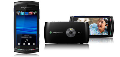
The Sony Vivaz
You can't say Sony don't try. For the past few years, prior to the iPhone launch, Sony pretty much dominated, in terms of handset functionality, attractiveness and reliability. There then came a flurry of software issues which they never really recovered from. Sony clearly hope the Experia and Vivaz will change all of that. The vivaz is from any angle an attractively built handset. The unit feels good in your hand and the buttons are well placed. Its only when you turn the thing on that things start to go wrong. Intuitive, it most certainly ain't. If you've owned a Sony in the past, it won't matter, all and sundry are going to have to consult the user manual. On initial boot up I am poking around and seeing what things do, without any success at all. I have this odd feeling that I may be missing something, so I consult the user manual. The main menu is accessed by pressing the single middle button in the bottom. This displays a drab grey looking 12 icon driven menu and you realise (like the Nokia) it is the same old Sony menu system! Booting up the wifi via settings shows me that the screen isn't that responsive, it takes a firm push to make selections, and even when you have (infuriatingly, like many Nokia menu options) you still have to push it a second time to confirm. The initial internet screen shows Sony's standard (very outdated) Playnow store, desperately in need of a revamp, and looking more WAP like than 3G. The unit connects to wifi, but won't allow me to search for a webpage using wifi, until the internet settings have been installed for the network. With the lack of a sensitive touch screen and being a bit small. I doubt I'm missing that much. A cursory glance in the media folder shows one standard photo that, if the handset is rotated to view properly, rotates so its the wrong way up again (chasing it 90 degrees to the left!) Useless. there is no music on it by default, so I can't test the speaker effectively, but I'm already losing enthusiasm. Perhaps I'm hopelessly bias, but again, at this price point, (which is the upper levels of the market) it should be so much more impressive and intuitive. I love gadgets, I love progress, I want easy to use and flash technology, this is making me lose the will to live. It seems like such hard work. I can't even be bothered to find out what the icons on the home screen are actually for. The up arrow seems to bring up a list of weird unrelated links, (apps, or shortcuts or favourites?) There's a twitter icon I don't want, a sky which simply shows me a full screen flowing blue sea/sky background (seriously, thats all it does) and a play icon, plus a favourite people? I don't know and to be frank, I don't care. This is 2010, we shouldn't need to ask. Wow me Sony Ericsson. This is pants.


Comments
Post a Comment